Actively Learn - Parity Project
McGraw Hill
Team
Project Manager
Senior UX Designer
Content Team
Developers
Client Relations Manager
Problem
How can we implement the same functions available on text based lessons and apply them to interactives, slide presentations, and video lessons to be consistent across all lesson types
Solution
I designed a unified framework that standardizes the available functions while adapting them to each lesson format. Through user interviews I was able to implement improvements focused on supporting student time management as well as consistency of navigation and functionality across all lesson types.
KPI: There was a 6% increase in use of interactive lesson plans.
How I contributed
• Designed custom iconography for the progress bar to foster active class conversations within the lesson.
• Made updates to existing navigation elements to assure consistency for an intuitive and streamlined user experience.
• Implemented a split screen format to facilitate real-time editing, review, customizing directions, questions, and notes for each lesson.
• Offered students a clutter free experience when reviewing lesson directions by adding its own introduction screen.
• Advocated for users during ideation process in favor of allowing students to preview the amount of questions in each lesson for their own time management reasons.

Product Improvement
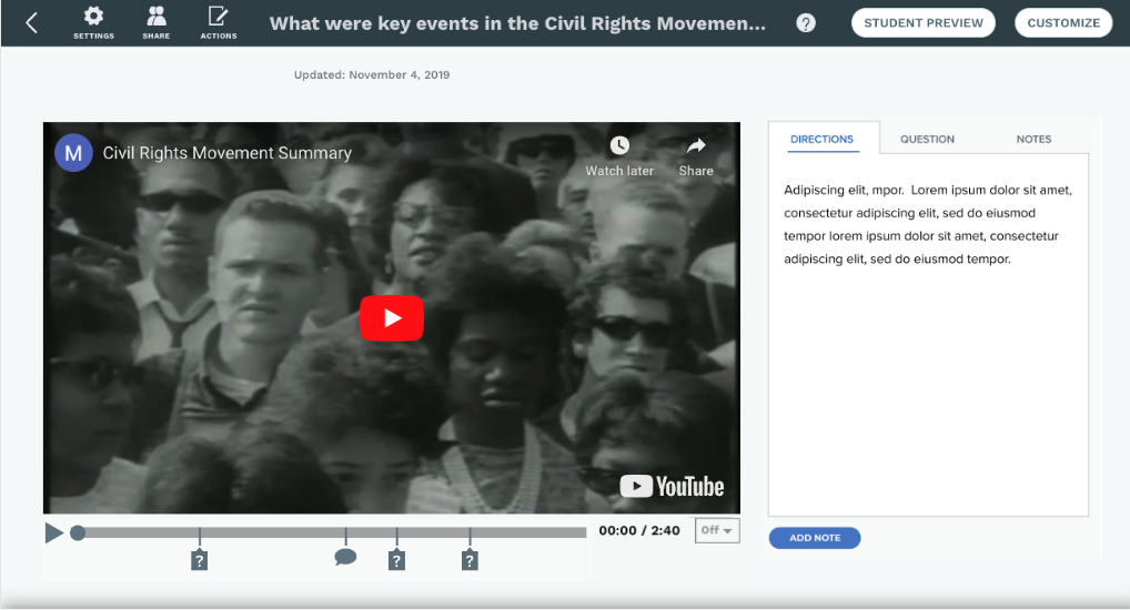
Video Lessons

Before
After
Challenge 1
Teachers needed an intuitive and quick way to customize templates to meet the various needs of their students.
Challenge 2
Some lessons had a high amount of icons for comments and questions. Icons needed to be recognizable and not overlap creating confusion.
Challenge 3
Teachers need flexibility to change location of questions, comments and extra help on progress bar.
Solution 1
I designed a tabbed format on the left panel so teachers can navigate through the lesson and toggle back and forth in the tabs to add any supporting notes, media or questions.
Solution 2
I modified the six of icons to facilitate many on the progress bar at one time without overlap. I created custom icons for teacher and student comments and a reply indicator.
Solution 3
Within the editing options I designed a separate screen modal showing the video with progress bar below. Teachers can then move the question or comment seamlessly to a different location on the progress bar.
Product Improvement
Interactive Lessons

Before

After
Challenge 1
Drop down menu was on the bottom right of screen instead of top right.
Challenge 2
Many students skip over the instructions which were imperative to fully understanding assignment details and functionalities before getting started.
Challenge 3
The Help function was more than two clicks away from the interactive hidden under the very small gear icon on the top right of the interactive.
Solution 1
I moved the drop down menu to the top right to be consistent throughout all lesson formats.
Solution 2
I designed a separate introduction screen before students are able to interact with the lesson. Giving the instructions its own screen called more attention to its importance.
Solution 3
I added a Help button on the main screen of the interactive so students can located it easier.
User Interviews and Design Process
As User Experience Designer, I conducted video meetings with the content team and teachers to gather insights on student needs. While the content team believed that students didn’t require visibility into the number of questions and notes in a lesson, teachers shared a different perspective—students felt more in control when they knew what to expect. Having access to this information allowed them to manage their time more effectively.
This teacher feedback significantly influenced my design decisions. To enhance clarity and usability, I implemented a progress bar and a right-panel dropdown menu displaying the total number of questions upfront at the start of each lesson. Additionally, I incorporated the beginning text of each menu item in the dropdown, enabling students to easily reference and revisit specific questions or comments.
Collaborating closely with the project manager, we identified key pain points and limitations, ensuring that our solutions remained clear, intuitive, and user-friendly. I also maintained consistent iconography across the newly introduced progress bar for all lesson types, reinforcing a cohesive experience throughout the platform.

Results
Key Performance Indicator: 6% increased use of interactive lessons
The final framework established a standardized set of options and functionalities across all lesson formats, ensuring a seamless and cohesive user experience. Through interviews and user testing with both teachers and students, it became evident that intuitive functionality, consistent navigation, and clear iconography were essential for an effective learning experience. These insights guided the design, reinforcing clarity and usability across the platform.
